Acid. Ooze. Alien.
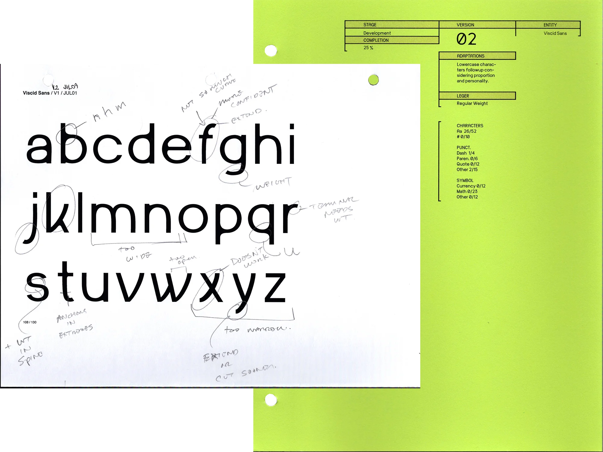
Over the course of 8 iterations my view on this project evolved tremendously. At first, Viscid was a shape-focused display face inspired by geometric custom lettering, but this left me unsure about which direction to take the font in as it quickly fell victim to gimmicky gestural decisions and an unclear line between geometric and humanist. This would all change upon the release of Alien: Romulus which I saw on opening night, forcing an abundance of flittering CRT screens and retro-futuristic signage into my brain. These themes would become the main driving inspiration for Viscid as I honed down the details and refined the flaws. Now after the 8 versions and specimen testing of this font, I value the end product for its visual uniqueness and function as a sans serif, as well as the lessons I learned about type and type craft along the way.